What Makes a Portfolio Actually Stand Out
Most portfolios look the same. We break down the three design choices that make people actually remember your work.
Why Your Portfolio Matters More Than You Think
Your portfolio isn’t just a collection of projects. It’s the first real conversation you’ll have with potential clients or employers. They’re not just looking at your work — they’re evaluating how you think, how you solve problems, and whether you’re someone they’d want to work with.
Here’s the thing: most portfolios fail because they’re built like resumes. You know, that format everyone uses. A bit of text, some screenshots, maybe a testimonial or two. Nothing wrong with that approach, but it doesn’t stand out. It doesn’t stick with people. After reviewing hundreds of portfolios, we’ve identified three specific design decisions that separate the memorable ones from the forgettable ones.

Design Choice #1: Ruthless Typography Hierarchy
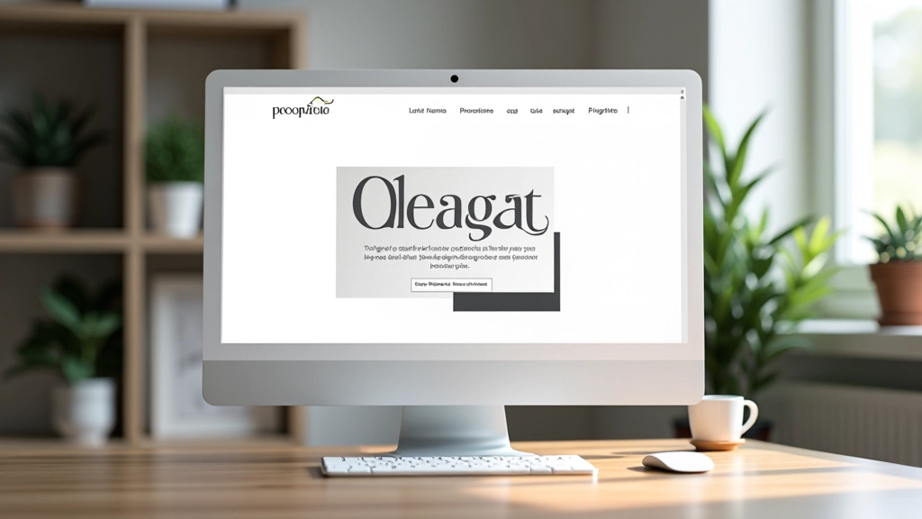
The first thing that separates standout portfolios is typography. Not just using nice fonts — that’s table stakes. We’re talking about how you arrange them. The best portfolios make one decision per page crystal clear through type size, weight, and color.
What does this look like in practice? A project title that’s genuinely large. Not 32 pixels. We’re talking 48-64 pixels. Then your supporting text drops down significantly — maybe 16-18 pixels. The contrast tells a story. It says “this matters” without you having to explain it.
Most designers are afraid of going big with type. They think it looks amateur. The opposite is true. Confidence in typography reads as professional.
Design Choice #2: Project Context Over Pretty Pictures
Here’s what kills most portfolios: they show the final design and nothing else. A beautiful mockup floating on a page. But that doesn’t tell the story. What was the challenge? What constraints did you work within? What decisions did you make and why?
Standout portfolios break this pattern by leading with context. You might show the original problem statement, then the design direction you chose, then the final result. Or you explain the constraints: “Client had a 2-week timeline and a fixed budget of 50,000 MYR.” Suddenly the work looks smarter because people understand what you achieved under real conditions.
This approach works especially well for Malaysia-based designers. Malaysian clients appreciate transparency about timelines and investment. When you show you delivered quality within real constraints, you’re speaking their language.

Design Choice #3: A Visual System That Actually Exists
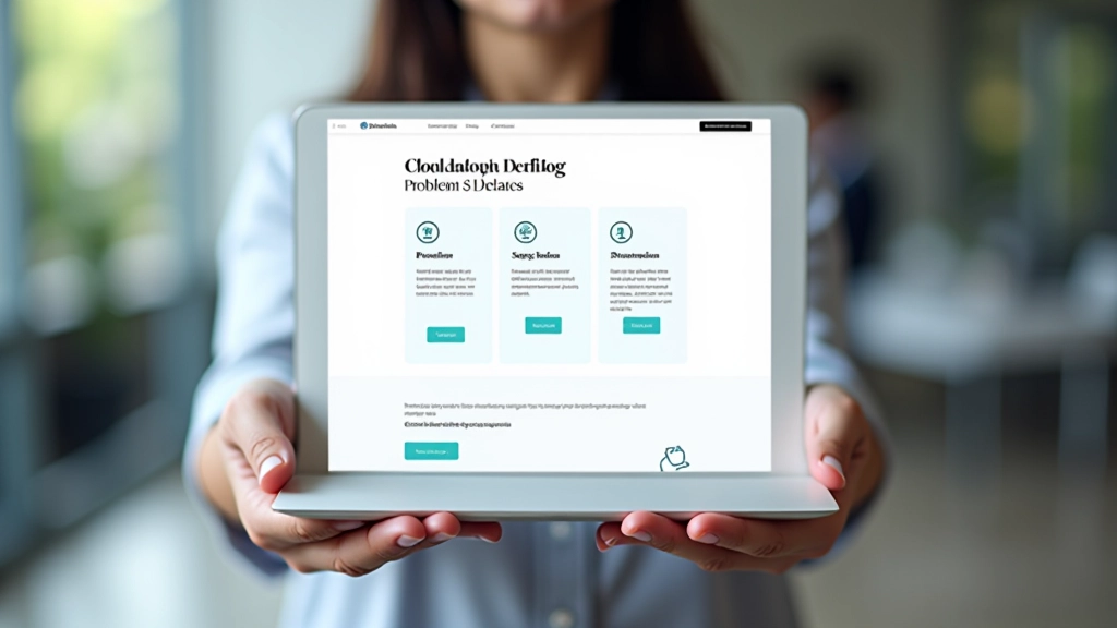
This one surprises people, but it’s crucial. The best portfolios have an actual design system. Not a fancy one necessarily. But you notice consistent spacing. Colors that work together. Typography that has rules. A grid that holds everything.
When your portfolio has a visible system, it communicates something powerful: you understand design fundamentals. You don’t just make things that look good — you make things that scale and stay consistent. That’s what separates good designers from experienced ones.
You’ll see this in portfolios where every project card has the same proportions, every heading uses the same size hierarchy, every image has consistent spacing around it. It’s not restrictive. It’s reassuring. It says “I know what I’m doing.”
How to Apply These Principles
It’s not about a complete redesign. Small decisions compound.
Audit Your Typography
Look at your current portfolio. What’s your largest text size? Push it bigger. If your project titles are 32px, try 56px. You might be surprised how much better it reads.
Add the “Why” to Every Project
Write one paragraph about the problem you solved. Not what you designed — why you designed it that way. What was the challenge? What did you learn? Include any relevant constraints.
Document Your System
Spend an hour documenting your actual design rules. What colors do you use? What’s your spacing unit? What’s your default line-height? Write it down. It’ll make your next project faster too.
“The best portfolios don’t show you how talented someone is. They show you how they think. That’s what you’re actually hiring.”
— Creative Director, Kuala Lumpur Design Studio
The Real Differentiator
These three choices won’t make your portfolio perfect. But they’ll make it memorable. And memorable is what gets you remembered during decision-making conversations. It’s what makes a potential client choose to reach out instead of moving to the next designer.
Start with one. Try bigger typography on your next project. See how it feels. Then add context. Then audit your colors and spacing. You don’t need to rebuild everything. You need to be intentional about the details.
That’s what separates portfolios that get noticed from portfolios that fade into the background.
About This Article
This article is informational and based on observations of design portfolios across different industries and regions. Portfolio success depends on many factors including quality of work, target audience, and personal goals. What works for one designer may differ for another. The principles discussed here are guidelines, not rules. Your portfolio should ultimately reflect your unique approach and values as a designer.